Thursday 23 June 2016

Ghostbusters Reboot

Are you one of the many people anticipating Ghostbusters coming out July 15, 2016. This reboot is Directed by Paul Feig and written by Katie Dippold and Feig.

The original movie came out in 1984 was  directed and produced by Ivan Reitman and written by Dan Aykroyd and Harold Ramis.

Today Jun 23, 2016 the theme song for the reboot has been released.Posted on the Fall Out Boy Youtube Vevo accompanied by Missy Elliot, also being called "I'm not afriad".

They have captured the interersting aspects of the original song but gave it a faster beat, gave it more of a rock feel. They have left the lyrics of the verse the same but changed the chorus. Instead of saying I ain't afraid of no ghosts, they now say I'm not afraid. Then in the middle of the songs Miss Elliot joins with a rap verse. When comparing to the original there is more techno additives then in the reboot.


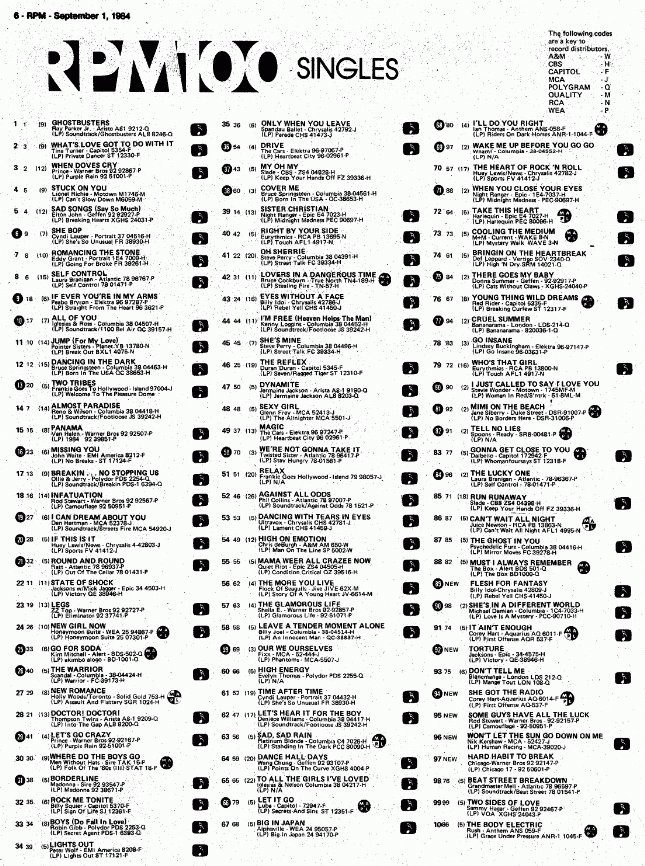
Both are great on there own and are fitting to the demographics and age for when they were made. In the 70's and 80's synth music was big, so the Ghostbusters original song is considered dance-pop,with a completely synth intro, according to Billboard. It was released in 1984 and in Canada reached number 1 on the top 100 RPM list.

When you look at the lyrics and compare them there is not much difference. But there will still be die hard nostalgic fans that will hate it. Instead of listening to the song for what it is and when it was made for. Here is a comparison of the lyrics:
    Ray Parker, JR                                        Fall Out Boy


This has been a moment from my Harte. :D

Friday 13 June 2014

Adventure Time Cake

I had a lot of fun making this cake with fondant, which was the first time I worked with the icing.
Now because it was my first time I made a mistake with the icing to cover the whole cake but I used the mistake to make the Ice Kings mountain, so it kind of worked out in the end. Now because I made it in the summer heat when we were singing happy birthday the fondant started melting and getting really soft. Some of the thinner pieces broke after they dried so toothpicks were used to mend them with sugar water. I also did it very last minute next time I will do it a couple days prior so that all the figures have time to dry.


Tuesday 10 June 2014

Star Wars Disney

What is better than combining Star Wars with Disney characters. There is an artist on deviantART who has some amazing pictures of Disney characters dressed in Star Wars outfits. The artist has found the best choices of Star Wars character outfits for each Disney characters persona. Jasmin looks like her character as if he didn't have to change much in her clothing she was a slave in the movie Aladdin so it fits. Making snow White part of the Sith I am not sure about, it still is a well done piece of art. Elsa kind of fits as Sith. Mulan fits as the bounty hunter, as does Sleeping Beauty in carbonite she does sleep a lot. Having Ariel as the |Jedi works with her underwater colours. Even Rapunzel looks good as a Padawan. There are some other characters I wish I could see from him. Other princesses and Star Wars characters, we shall see if he will come out with more. The Artist's name on deviantART is pushfighter if you want to check out more of his work. You should click his link anyways to get him more views and bring traffic to his awesome art renditions. I will be following him so I can see more of these when they come out.


Monday 26 May 2014

40 years of Dungeon & Dragons

After many years of the flourishing RPG game, they decided to mark the occasion with a revamp of the logo and graphics for the books. Here is a quick glance at the difference in the small ampersand sign they use. The focus is now on the design of the ampersand this graphic change is just a small scale version but they have made the ampersand the focus of the new logo design. 


Compared to even the previous logo the new one is focused more on the ampersand then the words them self. They have simplified the logo to create a stronger brand identity with the ampersand. When you compare the logo that was on the books last there is a lot going on. They have not only changed the font slightly they have left the words just a sold colour instead of multiple colours, shading, and depth. 

The original logo was simple and just words as you can see here. It progressed into text with the ampersand, then a dragon design in the ampersand, changed it completely with a sword I between the words and coloured text and changed the dragon ampersand and boxed it off, and finally to what you currently see for the logo of red fire text with a line to cut between the words and a dragon ampersand . They have made the logo more appealing and not so crowded with graphical elements.


It looks like they have decided to go back to the original design of Dungeons & Dragons with an ampersand. Do you really blame them?  When you simplify the logo it's easier for people to remember the logo and they are reaffirming their brand identity. 

The 40 year anniversary also rolled out the fifth edition of the books and manuals.


Compared to how the original looked it has nice graphical images with a clean and simple logo. Everything is legible and the colours work on any graphic image. 

Do you think that D&D has gone back to their original roots in the logo redesign? Do you think it is an improvement on their last logo? What are your thoughts? 

Tuesday 20 May 2014

Guardians of the Galaxy


A new movie poster was released for Guardians of the Galaxy. There is also a new extended trailer further into this post. The colours the graphics and the action in this movie look amazing. But we shall see what it really will be like when the movie comes out August 1st.


This poster is getting mixed emotions from people because it looks oddly like a movie poster made before. 
"It's not really a superhero film per se. It feels more like a Star Wars kind of film. And I play a kind of space cop." Chris Pratt "It's not as broad as Galaxy Quest but it's not a straightforward space fantasy like Star Wars. I think it's the sort of the best of both of those films put together...and more!"
Chris Pratt compared this movie to Star Wars, would it be too much of a coincidence that the movie posters would end up looking very similar.  

Along with the movie poster there are many pictures showing sneak peaks of what the movie characters will look like.


Here is a look at the first trailer for the movie. 


The teaser trailer


The Second Teaser trailer


The Third Teaser trailer


The Newest Trailer


If you want to see more videos of each character broken down you can go to Marvel's Youtube Channel which has a playlist of all the videos related to this upcoming movie. 
Some Background on the movie is that it is adapted from the Marvel Comic from 1969 as well as the 2008 release. 
                   1969                                                                                                            2008
              Marvel 1969                                                                                     Marvel Comics 2008-2010

This band of Criminal misfits will show that anyone who believes it can be a hero. I can't wait to see this movie. What are your thought on the movie? Was it a good idea for another marvel comic to be made into a movie. Did they keep some of the story true? 

I feel that it is going to be closer to the rebooted version of the comics than the ones from 1969. Even when you look at the pictures you can tell that the guardians of the galaxy from the past looks a little different, the idea and story line are going to be somewhat consistent.